Scroll down for English text
Schluss mit der Geschmacklosigkeit!
Lorenz Seidler, 2001
Erinnern Sie sich noch an das „beliebteste Bild Österreichs“? Anno 1998 baten das Künstlerduo Komar und Melamid Herrn und Frau Österreicher zur ästhetischen Meinungsumfrage. Der statistisch erhobene Mehrheitsgeschmack forderte ein Liebespaar vor Seelandschaft neben Blumenstrauß und Rehkitz auf die Leinwand und wurde anschließend als gnadenlose Kitschanhäufung mit spöttischem Grinsen präsentiert. Die vorschnelle Schlussfolgerung: Allgemein beliebte Motive haben in zeitgenössischer Ästhetik nichts verloren. Herr und Frau Kunstkenner sahen das Experiment als Bestätigung ihres exklusiven Kunstgeschmacks und marschieren seither umso tapferer durchs Museum.
Doch Kunst verschwindet nicht nur in „White Cubes“ oder im Dunkel eines Sammlertresors. Ausstellungsfläche Nummer Eins ist und bleibt die Wohnzimmerwand. Dort darf sie hängen und soll sogar gefallen, die Kunst. Wurde in jener Studie das Klischee vom hässlichen Klischee nur bestätigt, so gelingt Hannah Stippl in ihren Bildern das genaue Gegenteil: erfolgreicher Einsatz aller malerischen Mittel ohne Rücksicht auf deren Kitschpotential, elitären Stellenwert und sonstige Verbote der zeitgenössischen Geschmackspolizei.

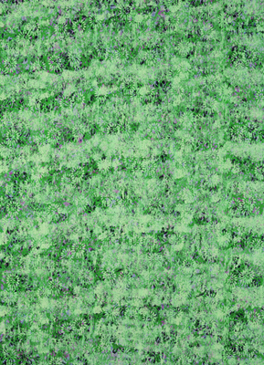


Walzenbilder, 1999, Dispersion auf Papier kaschiert auf MDF, 85 x 60 cm
Es werde Bild! Hannah Stippl wählt bewusst die einstigen Lieblinge (und heutigen Feinde) kunstsinniger Bildungsbürger und deren – innen: Tapetenmuster, Blumenbilder und den Motivfundus der Natur. Assoziationen an die blumigen Zeiten des Biedermeiers sind durchaus erwünscht, wahlweise bietet Hannah Stippl sogar passende Tapeten oder farbliche Abstimmung mit dem Wohnzimmersofa. Die erste Message der Bilder ist sichtbar: Der Hauptnutzen eines Bildes liegt noch immer in seinem dekorativen Potential. Sture Verfechter veralteter Ästhetiktheorien sollen sich trotzdem nicht zu früh freuen: Wo einst ein schöner Blumenstrauß von empfindsamer Künstlerhand auf die Leinwand gepinselt wurde, lässt Hannah Stippl zusätzlich die Mechanik der Tapetenwalzen walten. Stippls Blumenmuster haben weder Berührungsängste mit den Bildinhalten vergangener Jahrhunderte, noch mit der gestalterischen Willkür der Gegenwart.
Die sphärischen Farbabstimmungen, auf denen Stippls Blümchen erblühen, pardon, gewalzt werden, betonen die verklärte Weltsicht der Impressionisten ebenso wie die Tatsache einer vor- und zwischengrundierten Leinwand. Bloß ist die Grundierung bei Hannah Stippl weder weiß, noch einfärbig, noch einheitlich, noch stets an unterster Stelle. So rankt sich Schicht über Schicht über Pflanzenmuster bis zur blumigen Unkenntlichkeit. Hannah Stippl verknotet fröhlich die Arabesken vergangener Jahrhunderte mit den spielerischen Kapriolen heutigen Kunstschaffens. Das Resultat: Vormoderne Blümchen im postmodernen Remix.
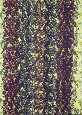
Ausstellungsansicht Galerie station3, 1999, Foto: Götz Bury
Im Gegensatz zu blauen Pobacken, Rinderblut oder expressiven Pinselperformances müssen sich Hannah Stippls Gestaltungselemente den Platz über dem Sofa nicht erst erkämpfen. Das Kunstwerk als vermeintliche Provokation des Kunstbanausen hat ausgedient. Kunst darf gefallen dürfen. Auch hier und jetzt. KünstlerInnen sind längst nicht mehr die missverstandenen Propheten künftigen Volksgeschmacks. Sie werden schon die längste Zeit als kreative Ideenlieferanten behandelt. Die individuelle Geschmacksentscheidung liegt bei den KonsumentInnen. Doch um dem Vorwurf der Geschmacklosigkeit zu vermeiden, bleiben jene, im wahrsten Sinne des Wortes, lieber gleich „geschmacklos“ und gehorchen auf den Marketingmühlen des Kunstbetriebs. Doch die Schere steckt nicht nur im Kopf des Betrachters. Theorielastige Qualitätsbeteuerungen in Form von Saalzetteln, Kunstpublikationen und Katalogtexten sorgen auch in Künstlerhirnen für präventiven Gehorsam.
Hannah Stippl hat im Laufe ihrer zahlreichen Nebenberufe als Organisatorin, Kuratorin und Archivarin im weiten Feld der Kunst die Fundamente (und Luftschlösser) künstlerischer Qualität kennen und beurteilen gelernt. Dieses Wissen bildet den ironischen Unterton ihres Griffes in die Mottenkiste der „Must Not’s“ zeitgenössischer Bildproduktion. Denn die viel zitierte „Freiheit der Kunst“ endet häufig dort, wo sie vom Kunstbetrieb selbst nicht gewährt wird. Hannah Stippl thematisiert die Zwänge der Kunstproduktion durch konsequentes Ignorieren. Es gelingt ihr, die Ästhetik der letzten Jahrhunderte mit den Ansprüchen der Gegenwart zu verbinden und gleichzeitig eine Brücke zu jenen Menschen (und Wohnzimmerwänden) zu schlagen, an denen zeitgenössische Kunst bisher nicht hängen geblieben ist.
Enough with the tastelessness!
Lorenz Seidler, 2001
Do you still remember the "most popular picture in Austria"? In 1998, the artist duo Komar and Melamid asked Mr. and Mrs. Austrian for an aesthetic opinion poll. The statistically surveyed majority taste demanded a pair of lovers in front of a seascape next to a bouquet of flowers and a fawn on the canvas and was subsequently presented as a merciless accumulation of kitsch with a mocking grin. The hasty conclusion: generally popular motifs have no place in contemporary aesthetics. Mr. and Mrs. Art Connoisseur saw the experiment as confirmation of their exclusive taste in art and have since marched all the more bravely through the museum.
But art does not only disappear in "white cubes" or in the darkness of a collector's vault. The number one exhibition space is and remains the living room wall. Art is allowed to hang there and is even supposed to please. If the cliché of the ugly cliché was only confirmed in that study, Hannah Stippl succeeds in the exact opposite in her paintings: successful use of all painterly means without regard to their kitsch potential, elitist status and other prohibitions of the contemporary taste police.
Let there be a picture! Hannah Stippl deliberately chooses the former favorites (and today's enemies) of art-loving educated bourgeoisie and their - inside: Wallpaper patterns, floral images and the motif fund of nature. Associations with the flowery times of the Biedermeier era are quite desirable, optionally Hannah Stippl even offers matching wallpaper or color coordination with the living room sofa. The first message of the pictures is visible: the main use of a picture still lies in its decorative potential. Nevertheless, stubborn advocates of outdated theories of aesthetics should not rejoice too soon: where once a beautiful bouquet of flowers was brushed onto the canvas by a sensitive artist's hand, Hannah Stippl additionally lets the mechanics of wallpaper rollers prevail. Stippl's floral patterns have no fear of contact with the pictorial content of past centuries, nor with the creative arbitrariness of the present.
The spherical color coordination on which Stippl's little flowers blossom, pardon, are rolled on, emphasize the transfigured world view of the Impressionists just as much as the fact of a pre-primed and interprimed canvas. But in Hannah Stippl's work the priming is neither white, nor monochromatic, nor uniform, nor always in the lowest place. Thus, layer upon layer of plant patterns entwine themselves to the point of flowery unrecognizability. Hannah Stippl happily knots the arabesques of past centuries with the playful capers of today's artistry. The result: pre-modern florals in a post-modern remix.
In contrast to blue buttocks, cattle blood or expressive brush performances, Hannah Stippl's design elements do not have to fight for their place above the sofa. The work of art as the supposed provocation of the art philistine has had its day. Art is allowed to please. Here and now, too. Artists are no longer the misunderstood prophets of future popular taste. They have been treated as creative suppliers of ideas for a long time. The individual decision on taste lies with the consumer. But in order to avoid the reproach of tastelessness, those prefer to remain "tasteless" in the truest sense of the word and obey the marketing mills of the art business. But the scissors are not only in the head of the viewer. Theoretical affirmations of quality in the form of hall labels, art publications, and catalog texts also ensure preemptive obedience in artists' brains.
In the course of her numerous sidelines as an organizer, curator, and archivist in the broad field of art, Hannah Stippl has come to know and judge the foundations (and castles in the air) of artistic quality. This knowledge forms the ironic undertone of her reach into the mothballs of the "must not's" of contemporary image production. For the much-cited "freedom of art" often ends where it is not granted by the art business itself. Hannah Stippl addresses the constraints of art production by consistently ignoring them. She succeeds in combining the aesthetics of the last centuries with the demands of the present and at the same time builds a bridge to those people (and living room walls) to whom contemporary art has not yet stuck.